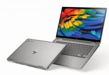
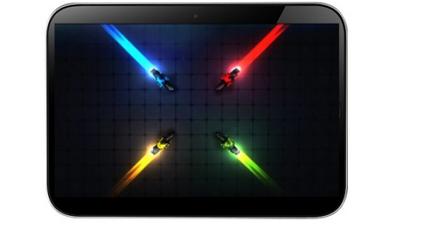
As the world starts getting more and more of Android 8.0 Oreo, Chrome OS is also getting a bump up in version. Chrome OS 61 is a thing now and it comes fresh after Chrome 61,that debuted last month on desktop and Android. We have some details on changes and new stuff below.
The first big change is the new lockscreen/login screen. The old UI approach involved a single card in the middle of the screen showing the user’s profile picture above the password text box. Meanwhile, the new approach feels a ton like macOS, with the whole wallpaper blurred. The profile picture also gets round now. There’s also a brand new app launcher, that has been in testing phase for a while.
It went live in the stable channel and can be triggered (forced) by setting the “peeking launcher flag” to Enabled. The old layout had a card in the center of the screen, with the Google doodle at the top and the recently opened apps below. The fresh launcher slides up from the bottom and shows a Google search bar, plus the recently started apps. A partly transparent black background is included here, but some folks are reporting a blurred background is in the works.
Once you open the launcher in tablet model, it expands automatically. There’s also a new profile picture picker, improved power management options and improved window management in tablet mode. Chrome OS 61 is said to have only reached a few Chromebooks, but rest assured it’s coming to you soon.
Post Footer automatically generated by Add Post Footer Plugin for wordpress.


