JooJoo was supposed to be the tablet to rule the world, before the iPad was a mere concept. Now, it has been delayed a bunch of times, had a scandal associated to it and TechCrunch and quite a lot of changes, as far as the software, UI and hardware are concerned. This product is becoming more and more like Starcraft 2: a real ghost.
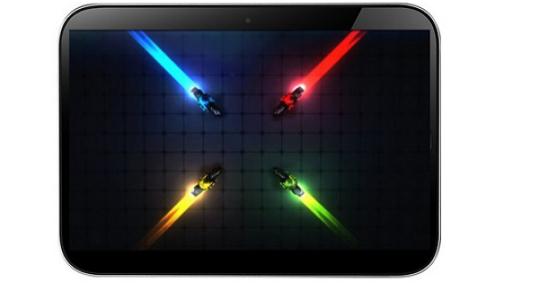
Fusion Garage is solving issues with its capacitive touchscreen right now, as we’ve learned from a previous piece of news. Also, the maker of the tablet took advantage of the product’s delay to also work on its interface. Its homescreen has been revised, as you can see in the shots included in this article.
We have to say that the icon grid looks great on the high-res customizable wallpaper, couple with a vertical swipe that brings down a status bar. The latter includes the Home Button, status indicators and browser navigation controls. An address bar/search field combo is also present in there, while the improvements of the UI also include better scroll behaviour, with two types of actions: a two finger scroll (used like a scroll wheel) and a single finger pan (with the role of mouse arrow).
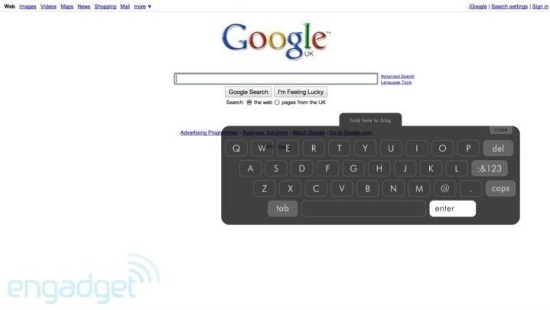
These scroll mechanisms will be particularly useful in apps like Google Maps and Fusion Garage claims that it wants to deliver the full web experience through such implementations. Text entry has also been improved and now there’s a smaller keyboard shown on screen, for easier one handed operation. More info on JooJoo interface upgrades in Engadget’s piece over here.
[via Engadget]
Post Footer automatically generated by Add Post Footer Plugin for wordpress.


