Samsung Galaxy Tab 2 7.0 is 90% the Galaxy Tab 2 10.1, only changing the battery and screen from that model, so it’s not going to be hard to review this machine. We’ve already reviewed the 10 incher here, in case you’re wondering. Anyway, know that the Tab 2 7.0 costs $249 in USA and in the following months you may even find it for a cheaper price tag. After all it has to rival the Nexus 7, that only goes for $199, right?
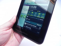
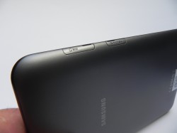
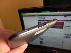
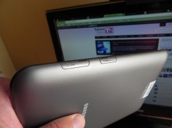
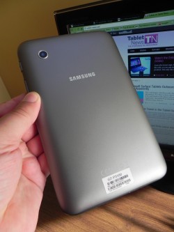
Available in black or white, this model can be found with either 8 or 16 GB of storage, but there’s also a 32GB version out there. Our unit was the 3G one, with a SIM slot near the microSD one. The device was announced early this year and at first contact it feels like an enlarged phone. If you hold it in portrait mode, the phone orientation is clear from the logo, the side volume button and On/OFF keys, plus the slots on the side. It’s still a very comfortable to hold slate, with good grip and decent resilience.
Its plasticky case may not be to your liking, but I found it to be both resilient and scratch free. My only objection about the design is the fact that the slot lids are hard to close. Also, you should know that at the bottom of the Galaxy Tab 2 7.0 there are two stereo speakers and the proprietary port typical for Samsung. The tablet measures 10.5 mm in thickness, weighs 344 grams and features a PLS LCD 7 inch display with a 1024 x 600 pixel resolution.
Other specs include HSDPA 21 Mbps connectivity, WiFi, DLNA, Bluetooth 3.0 and infrared, the latter being useful if you want to control your TV using a tablet. Inside there’s a dual core TI OMAP 4430 1 GHz processor, with PowerVR SGX 540 GPU, just like the Galaxy Tab 2 10.1 had. Other features include an accelerometer, gyroscope, compass, GPS and Glonass. Finally, there’s a 4000 mAh battery under the hood, good enough for 7-8 hours of fun. The important thing to mention here is that the Samsung Galaxy Tab 2 7.0 also has a phone feature, like its bigger counterpart.
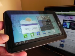
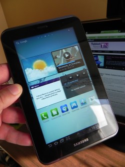
Thus, you can call and text the people in your contacts list, most likely using a headset, since holding the device to your ear looks ridiculous. This slate runs Android 4.0.3 with TouchWiz on top, but I don’t need to tell you that, since it’s a pretty standard Samsung experience by now. One of the customizations involve placing a screenshot button next to the multitasking one, plus that famous Mini App Tray, with the apps that are always on the screen if you open them.
The virtual keyboard is comfy and that extra row of numbers is useful, while the web browser offered by default here is both responsive and fast. Now let’s get to the benchmarks! Tab 2 7.0 scores 2695 points in Quadrant, very close to the 2647 scored by the bigger version and surpasses the Tab 7.7, that only scored 1947. It’s true, that model didn’t have Android 4.0, that would probably increase the score a bit. Also, the Tab 2 7.0 beats the Motorola Xoom 2 8.2, that scored below 1700 points.
In AnTuTu we scored 5366 points, which as a reference point is about half the score you get on a Galaxy S III handset or HTC One X. In NenaMark 2 we have a modest 26.3 fps, lower than the 37 FPS of the Galaxy Tab 7.7, but better than the 18 FPS of the Galaxy Tab 2 10.1, that had to move more pixels on the same CPU. On the multimedia side we have the usual mediocre camera with 3.15MP sensor and no flash, but at least there’s a panorama mode to have fun with. Video looks crisp and clear, viewing angles are great on the 7 inch display, but sunlight visibility is not that good.
Audio is truly excellent and the stereo speakers are as loud as it gets on a 7 inch tablet. There’s also a VGA camera upfront, if you want video calling. Obviously you can do multitasking via swipe, thanks to the classical mechanism in Android 4.0 and you have your usual widgets and apps accessible via the top right side of the screen. On the lower right side there’s the settings area with some connectivity buttons included as well. Finally, there’s the Samsung Apps store with a recent UI revamp (but it wasn’t working during the review, probably because of the updating process) and we also have the usual Game Hub, Readers Hub and Music Hub, that you know all about.
The S Planner calendar on steroids is also here, as well as resizable widgets, but there’s nothing really important to note on this device, as far as software goes. So, time for the verdict! On the plus side, we have a cheap tablet, that’s lightweight, has good speakers, decent screen, a phone feature and it’s very comfortable to hold. The setbacks are the battery, lack of camera flash, glossy screen, plasticky case and plastic lids covering the slots. Also, the CPU is kind of old for 2012…
Overall, we give it an 8 out of 10 for design, 7 for hardware and 7 for OS and UI, for a total of 7.33 out of 10. I guess that our next Galaxy Tab model for review will be a quad core one, right?
[youtube HPVhf0Wgey0 660 520]
Post Footer automatically generated by Add Post Footer Plugin for wordpress.


