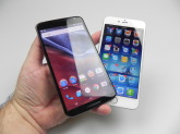
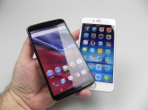
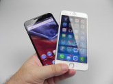
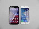
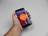
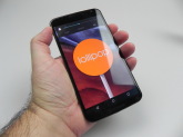
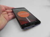
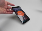
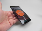
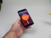
Motorola Nexus 6 is the latest Nexus flagship phone, that was announced in October and launched in November. This is the first Nexus phablet on the market, a 6 incher and the first Motorola made Nexus. It’s also the first Lollipop device we ever tested. The product is priced at $649 and it’s analyzed attentively in the following lines.
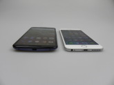
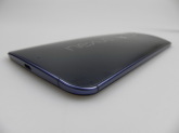
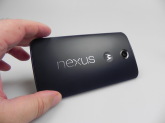
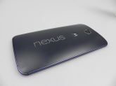
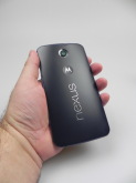
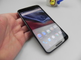
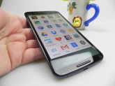
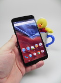
The Nexus 6 measures 10.1 mm in thickness, weighs 184 grams, thus being 8 grams heavier than the Galaxy Note 4. It’s big, massive and bulky and even the fans of the iPhone 6 Plus and Note 4 will have a hard time adapting to this format. We’ve got an exposed aluminum frame here, great build quality and a solid case overall. The facade is completely covered in a Gorilla Glass 3 layer, while the back is made of plastic, that tends to get fingerprints on it and grease.
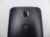
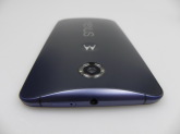
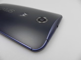
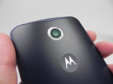
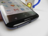
We’ve got a curved profile and this device is slightly water resistant or better said splash resistant. It’s thicker in the middle and thinner at the edges, thus fitting better in the user’s palm, plus it has a reasonably thin bezel. The Nexus 6 features rounded corners and at the front you’ll find dual speakers, a front camera and sensors, while the back offers the main camera with a plastic ring on top of the dual LED flashes, the Nexus logo printed with metal and a small hole in the ring area, maybe a microphone.
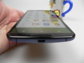
There’s also a microphone at the bottom of the back side. At the top of the smartphone we find the audio jack and the nano SIM tray, while the bottom holds the microUSB port. There’s nothing on the left side, while on the right we find the On/Off button and volume buttons, that are a bit too thin to be comfy. The quality of the build is below the one of the Motorola Turbo, if you ask me and that would have been a better Nexus phone.
The proportioning is not very impressive and overall this is one massive phone, simply too big for fans of 5 inch phones. On the hardware side, the handset comes with a 5.96 inch display with a 2560 x 1440 pixel resolution, an AMOLED panel with a 493 ppi density. Inside we find a quad core Qualcomm Snapdragon 805 2.7 GHz processor, with Krait 450 cores, an Adreno 420 GPU, 32 or 64 GB of storage and no microSD card slot is present here.
The RAM quantity is 3 GB and other specs include a 13 megapixel camera, with OIS and dual LED flash, plus a front 2 MP shooter. On the connectivity side there’s HSDPA, LTE Category 6, with 300 Mbps download, WiFi a/b/g/n/ac, Bluetooth 4.0, microUSB 2.0 with Slimport support, GPS, Glonass, WiFi Dual band, WiFi Direct, DLNA and NFC. In the section we call Others there are the accelerometer, gyroscope, proximity sensor, compass, barometer, stereo speakers and Qi wireless charging.
The battery here is a 3220 mAh unit, exactly the same capacity as the one of the Galaxy Note 4. On paper, the battery provides 330 hours of standby or 24 hours of talk time. In our test, that involves a HD video playback loop with WiFi on and brightness at 50%, we achieved 8 hours and 30 minutes of playback, just like the Galaxy Note 4. Meanwhile, the iPhone 6 Plus scores 12 hours, so the Nexus 6 is not very impressive.
With average use you’ll be able to reach one day and a half of usage, with phone calls, browsing, apps, email and videos. I expected more, to be frank, from such a big phone. We’ve got fast charging here, so with 15 minutes of charging you’ll get 6 hours of usage. The charging from 0 to 100% takes 1 hour and 50 minutes, which may sound impressive, but the Galaxy Note 4 does that in 1 hour and 40 minutes.
The charger offers 3 types of charging, as written on it: Standard, with 5V and 1.6A, Turbo 1, with 9V and 1.6A and Turbo 2, with 12V and 1.2A. The device tends to overheat past 40 degrees Celsius while charging, by the way, so it’s a bit unpleasant. The Settings area includes simple graph and a battery saving option, that limits vibration, background data, reduces performance and I must mention I regret the fact that there’s no battery percentage on the status bar.
In conclusion, the charging is super, but the battery life is not impressive. Moving on to acoustics, we’ve got no bundled headphones, just like the Nexus 5 and there are stereo speakers integrated here, at the front. The music player included here is Play Music, with the new Material Design and the speakers offer a crisp and clear sound, with all the notes heard well, very good bass, deep and warm sound. The volume is not as high as one would expect from a Nexus flagship or a 2014 flagship.
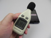
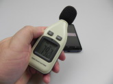
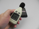
The settings area includes an equalizer with 5 custom channels and a surround sound option, that is actually felt. We also did a decibelmeter test, achieving 79.2 dBA, which is disappointing, since the iPhone 6 Plus achieved 83.8 dBA and the Galaxy Note 4 goes to 89.5 dBA. However, in the real life acoustics experience, I feel the Nexus 6 above the iPhone 6 Plus, but only by a bit. The headphone experience is OK, at least with the Earpods I tried out.
And now let’s discuss the screen a bit… This one is a 5.96 incher, an AMOLED display with a 2560 x 1440 pixel resolution, with 493 ppi density. We used MX Player as the video player of choice, since the Nexus 6 relies on the Photos app for playback and there’s no stock video player. The Photos app has codec support including H.263, H.264 AVC, MPEG4 and VP8. The experience per se is oversaturated and the screen is bright, but far from the Samsung AMOLEDs. There are deep blacks, an OK contrast, wide view angles, but the display could be brighter.
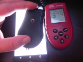
Frankly, this display doesn’t exactly feel like a Quad HD one, or a high jump from Full HD. The pixels are of the Pentile Matrix kind and the LUX level is 380. That’s clearly lower than the Note 4 and its 682 LUX and the 623 LUX of the iPhone 6 Plus. The screen is placed below the Note 4, but not with a lot below the quality of the iPhone 6 Plus. Don’t get me wrong, the screen is superb for watching movies and playing games, but it isn’t the ultimate champion one would expect. The Settings include Adaptive Brightness, that’s optimized for room lighting and sun lighting around you.
There’s also a feature called Ambient Display, that wakes up the device when picked up. Overall, we say the screen is good, but it’s no champion, for sure. Oversaturation and less brightness than expected are its problems. The camera is a 13 megapixel unit, with optical image stabilization, F/2.0 aperture, which is an upgrade from the F/2.4 aperture of the Nexus 5 and a Sony IMX214 sensor, the one used on the OnePlus One.
The sensor is a 4:3 one and the dual LED flash with plastic ring feels like a kitsch. The camera UI is very, very minimalistic, as usual and the camera is capable of fast focus. The photo capture itself is slow, especially compared to an iPhone, for example. If you swipe from the left to the right, you’ll trigger a series of photo features, like Photo Sphere, Panorama, Lens Blur, Camera or Video. Lens blur was launched months ago and it’s able to create a depth of field effect and refocus the shots, with a special slider for the blur effects.
You can either focus on the background or the foreground, after taking the shot. The right side area settings include resolution (13 megapixels in 4:3 or 9.7 MP in 16:9), video resolution (4K, 1080p or 720p), Panorama (quality options high, normal and low), Lens Blur (quality normal or low). You can also save the location of the photo and the Advanced settings include exposure (auto or manual). On the right side of the screen (no swipe) there are options like the front camera shortcut, flash, HDR+, grid, timer and exposure.
I have to admit I didn’t like the camera of the Nexus 4 or Nexus 5 and that wasn’t a subjective thing, since they were simply poor by the standards back then. Well, Nexus 6 redeems them. Checking out the Panorama shot we took, we find it offer good stitching and it’s taken fast and efficiently. It has a pretty low resolution, at 10 megapixels, while other phones go to 50 MP or so. At least it looks good…
We’ve got good zoom and surprisingly the quality doesn’t drop very much when zooming in, even on a cloudy day. Focus is good, white balance and exposure are also good and the blitz handles lower light conditions in an OK way. Macros look very hot, like the water drops on that doggie statue. We’ve got vivid and realistic colors and once again macros are simply superb, thanks to a very good ability to focus. Colors get very cold in low light and the focal length of most shots is 3.8 mm, as shown in the Details area.
The pictures taken during daylight are clearly superior to the ones of the Nexus 5 and also above the ones of the Sony Xperia Z3. However, we aren’t superior to the Xperia Z2, the Galaxy Note 4 or the iPhone 6 Plus. I would say that the Nexus 6 is the equal or a bit over the iPhone 6. As far as night time capture goes, I was very impressed by the colors, but the light source handling is poor. Cars in motion are also unimpressive, with a bit of motion blur going on.
Shots are bright, even at night time and we’ve got good details and no trace of that annoying yellow hue that plagues some handsets. The level of detail is OK, but this no iPhone 6 Plus or Xperia Z2, to be honest. This is maybe the LG G3 level, if you really want a comparison. On the video side, we are promised OIS, but the actual stabilization didn’t impress me, being below the iPhone 6 Plus and around the level of the iPhone 6 and Note 4. We also pulled a 4K video near a lake, with an exaggerated continuous autofocus, but a crisp and clear image, good white balance and exposure, as well as colors.
The Full HD video has great quality, impressive even when zooming in and a slight focus loss again. The colourful video of Mickey Mouse has focus problems again, but it looks swell. The captures have mono sound and the bitrate is 17 Mbps for the Full HD vid and 42 Mbps for the 4K one. There’s no 60 FPS filming, just so you know. The video capture files are of the MP4 kind. As far as the night time video capture is concerned, we registered some noise, but the colors were OK, actually pretty good and the quality of the clip when zooming in was mind blowing.
There are still focus problems, but at least the quality is good. The 4K video we tried out at night suffered a bit from focus loss, but it felt like the cold was the one to blame here. I’d say that overall, this camera is below the one of the Note 4 and iPhone 6 Plus and above the one of the Sony Xperia Z3 and BlackBerry Passport, for example. It’s also clearly superior to the one of the Nexus 5 and the equal or above the iPhone 6 (rather above).
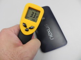
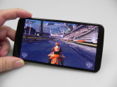
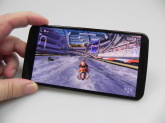
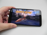
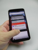
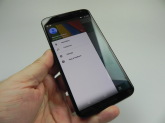
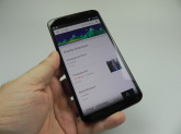
Now we can have a look at the temperature, that reached 34 degrees Celsius after playing 15 minutes of Riptide GP2, so there’s no ovearheating here. We did experience overheating when playing Game of Thrones Iron from Ice and when charging. The stock web browser available on the Nexus 6 is Chrome and it’s very fast, plus it integrates its tabs within the multitasking carousel window. The stock keyboard is also nice looking and comfy, well spaced and adopts the Material Design, getting rid of the delimitating lines. In the phone section we find a redesigned dialer, with solid color and flashy animation. The sound is OK and loud, plus clear and signal is also OK.
However, we’re certainly not on par with the iPhone level of isolation. And now we will have a look at the benchmarks, where we compared the Nexus 6 to the iPhone 6 Plus, Galaxy Note 4 and LG G3. Here are the results:
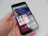
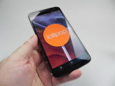
The Nexus 6 wins 3 out of the 10 battles, but it generally registers good scores. It can run any 3D game on the market and it obviously has no lag. The OS of choice here is Android 5.0 Lollipop, formerly known as Android L, in its prototype phase from months ago. It adopts the already famous Material Design, that involves colourful and flashy animations, realistic lighting and shadows, responsive usage and vivid new colors.
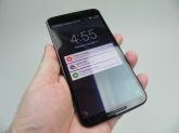
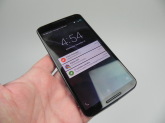
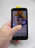
There’s new typography, new effects and icons and the notification system allows you to answer them from the lockscreen and check them out there, shown as cards. You can hide sensitive content from the notifications now and if you push the volume buttons on the Nexus 6, you’ll also discover the new Priority option. It allows you to set up a time frame when you can’t be interrupted by calls, reminders and notifications. You can also set exceptions for certain contacts to get through, obviously and schedule a daily downtime. The incoming calls won’t interrupt the movie or game you’re playing, so you can discretely choose to answer or keep doing what you’re doing.
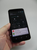
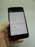
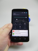
The app notification priority can now be set up as well and we’ve got an intelligent ranking system for notifications, depending on their type and the people they come from. The battery now has a more efficient management and there’s an estimated time to full charge shown on the screen when charging. Security is also beefed up, with better encryption and moving on to other new features, there’s a fresh Quick Settings area approach, now unified in the same area with the notifications. The Quick Settings are more aired out, offer bigger icons and they’re better spaced.
You can add a guest account or user to the experience and let them keep the same WiFi network. The Internet connection has been improved as well and so has the Bluetooth low energy connection. Finally, Android 5.0 Lollipop relies on ART, not Dalvik for the runtime. It offers an up to 4X performance boost, 64 bit support and 5.1/7.1 audio channel support. There’s USB Audio support, allowing you to plug in USB microphones, speakers, amps and mixers, plus Open GL ES 3.1 availability. RAW picture format is also here, plus support for OK Google has evolved.
There are 15 new languages available in Android 5.0. and the multitasking section has been turned into a 3D carousel, but functionality stays the same. The same Lollipop keeps an unified experience on TVs, watches and cars and comes with support for 4K playback. It can also extend the battery life by up to 90 minutes according to Google. My personal impression is that Lollipop takes a while to get used to. The animations are complex, everything is colourful and the effect that appears when scrolling at the bottom of a vertical list is a bit overkill.
This Android is an abstract one, as proved by the geometrical virtual Android buttons, but there’s also an interesting concept called depth. Apps like Google+, Gmail or Calendar have a button that’s raised on top of all the other elements, through a 3D effect. It’s usually the add/compose button and the same depth is applied to cards and notifications. We now have bold and more dynamic colors, the photos fade in or out and there’s transparency in the Android button area. I don’t like the white background of the App section and the Google Now homescreen is pretty much were we left it.
The status bar and header will get two shades of the same color in many apps, which is a trend that will be kept for a long time now, I feel. The applications available on the Nexus 6, the preinstalled ones are all stock and you’re probably familiar with them, since their new version has already arrived on a ton of Android devices. They adopt the Material design and new design traits. For example, the Calendar app is totally changed, gets a 5 day view and an Agenda view that looks very nice. It’s filled with colourful cards related to the time of the year, events and various scheduled stuff. For example, a dinner is shown with a knife and fork and a dentist appointment with a dentist symbol.
Some schedule items also have addresses next to them. The list of apps also includes, Docs, Google Earth, Google Fit and Gmail, now with support for Exchange and non Gmail accounts. There’s Google+, Keep, Google Maps, Messenger, that feels a bit redundant in the presence of Hangouts, News+Weather, finally with a new UI, Photos, the Play Suite, Sheets, Slides and YouTube, also with a new design.
Now that everything is said and done it’s time for the verdict.
Here are the Pros:
solid build
fast charge
crisp speaker
good display, but no champion
fast focus
best Nexus camera ever
superb macros
good zoom quality and camera colors
simpler to use Android
better notifications
And the Cons:
expected more from speakers (volume)
oversaturated screen
huge format
battery could be better
UI takes time to get used to
not very bright screen
OIS not as impressive as on other models
focus problems
overheating when charging
The Nexus 6 gets from Tablet-News.com an 8.9 out of 10 for design, a 9.2 for hardware and a 9.7 for OS and UI. The final grade is 9.26 out of 10 and this handset has the best camera on a Nexus phone ever. It also offers good performance, an intuitive fresh UI and it’s the best pure Android phone money can buy right now. It’s an excellent media device, a good gaming console and tablet replacement.
[youtube AFrK_2qwo2Y 660 520]
Post Footer automatically generated by Add Post Footer Plugin for wordpress.


