Microsoft has been using Metro UI for 7 years now and while some people are still annoyed by it, others have just gotten used to it. Still, there’s a lot of room for improvement, as shown by other modern UIs out there. The latest hints come from Microsoft itself, as they prepare something called “Project Neon”.
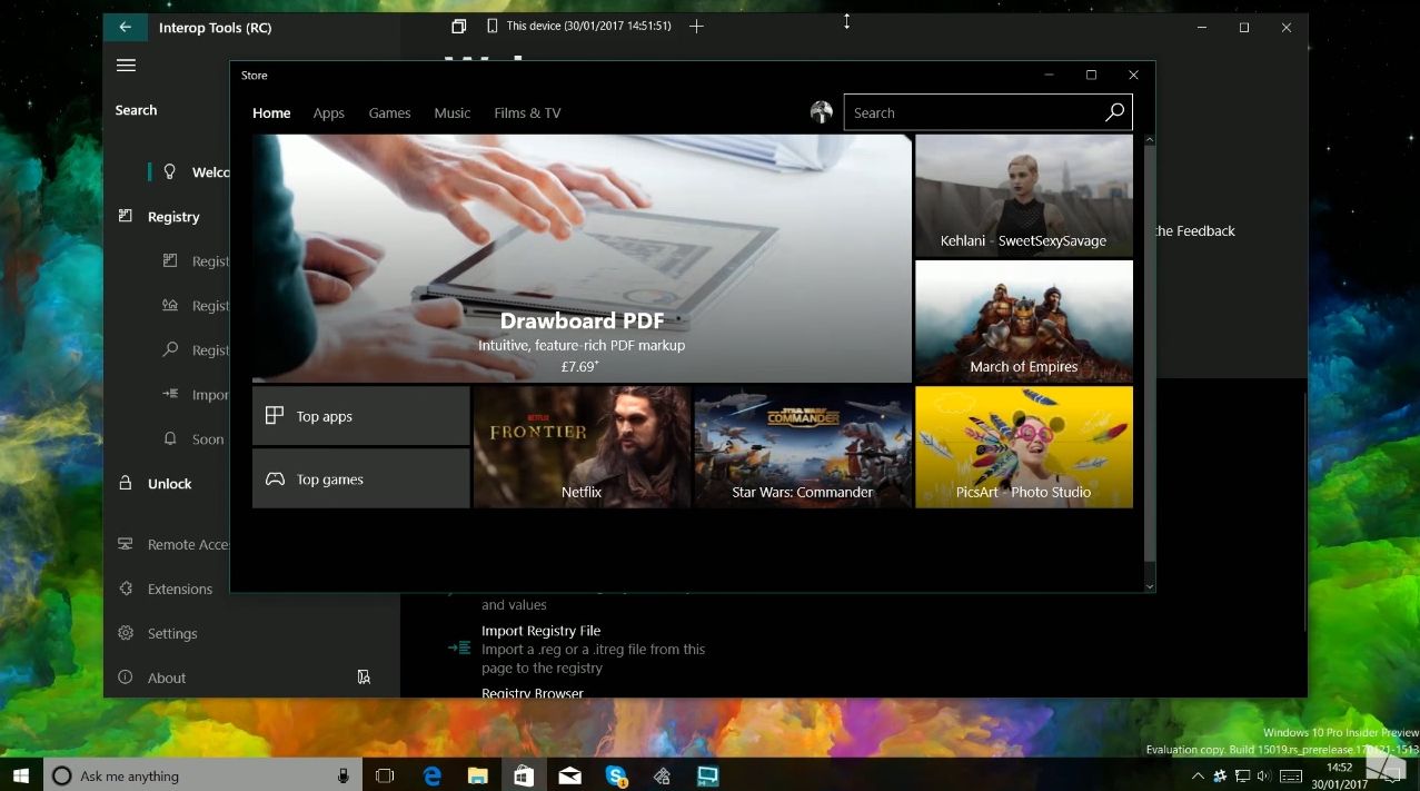
It involves a new design language, based on semi-transparency in menus and what seems to be a more serious approach, with gray and black backgrounds. As part of the Windows Developer Day livestream some shots of Project Neon were seen in the background of PowerPoint slides shown on stage. Project Neon could come to the entire Microsoft portofolio, including Xbox, HoloLens and Windows 10 Mobile.
Redstone 3 may bring the UI to Windows 10, but APIs have already appeared in the latest insider preview builds for Windows 10. Semantic animations, built in effects and new controls are all included. This polished design has fluid animations, transparencies and blur meant to streamline the content and make the whole experience “gel” together.
Consistency is a big deal and this feels in line with what Huawei and Sony have been using in EMUI and Xperia UI, in the sidebars and menus for a few years now. It’s also a response to iOS and Google’s Material Design. Expect more info at the BUILD conference this year.
Post Footer automatically generated by Add Post Footer Plugin for wordpress.


