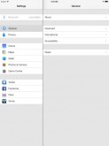
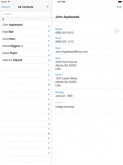
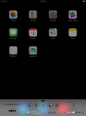
We’ve shown you here how iOS 7 MIGHT look on the iPad, but now we have authentic screenshots of the platform unveiled last week and the shots were taken on an iPad. Sonny Dickson has released these pictures, that you can check out below.
I have to say that the transparency thing with blurry stuff in the background is truly horrid. It feels like a menu from a game like Resident Evil or something like that. It’s like you’re pausing a game, but you’re also kind of seeing what’s happening in it. The connectivity toggles from the bottom of the Control Center area look even creepier.
The spacing is badly thought and the fact I’m still seeing stuff in the background is once again disturbing. This beta is available to registered developers who can test out iOS 7 on their iPads. It’s interesting to notice that there’s a flashlight feature in Control center and since the iPad doesn’t have a LED flash, I expect a future generation to come with such a perk.
Post Footer automatically generated by Add Post Footer Plugin for wordpress.


