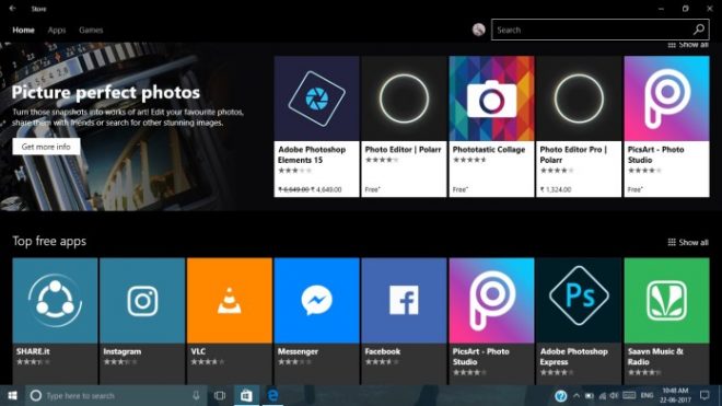
We have mixed news today about Microsoft’s products. Turns out that Microsoft Windows Store just got a new UI, on both Windows 10 and its mobile version. On the other hand Wall Street Journal is pulling its app from the Store. And once again back to the good news, Spotify gets its app in the Store.
But the main change remains the updated interface on both Windows 10 platforms. The update has to do with visual changes, linked to the new Microsoft Fluent Design approach. It bets on 3D, transparency and better clarity and navigation. We’ve got new white boxes and grids in the Windows Store to confirm that. They separate Store items and there’s also a new font style and floating hero images.
Interestingly, the Apple App Store also got a major update this month, so now only the Google Play Store is due one. Windows Insiders have been seeing the new Windows Store for a while, but now the public finally gets to also the fresh UI, courtesy of the latest update. Version number goes to 11705.1001.21.0. The update also brings smoother animations, faster loading times and big fixes.
People have mixed feelings about the new solid coloured background for apps in the Downloads and Updates area.
Post Footer automatically generated by Add Post Footer Plugin for wordpress.


