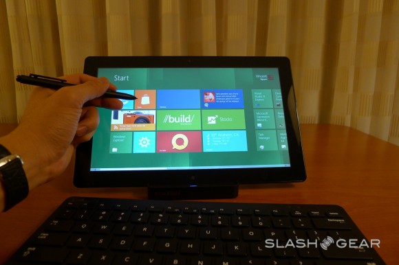
If you have been browsing the web over the past hours I am pretty sure you’re familiar with the fact that Microsoft detailed the Windows 8 platform during BUILD 2011. Courtesy of Slashgear we got to watch a hands-on experience with the new tablet, that’s shown below.
These guys have testing the tablet in all its aspects, from the 8 second booting sequence to the efficiency of Internet Explorer 10 and the touch browsing. The first thing that comes to mind when using the UI of the tablet is Windows Phone, since the Windows 8 interface borrows heavily from Metro UI. Microsoft wants you to know that this is a mere preview, at least of the hardware, since the software will most likely keep this form factor.
Slashgear reports that the virtual keyboard is very usef-friendly, well laid out and responsive, plus there’s a clever lock screen system that allows you to choose a photo and sketch out lines, circles or swipes. Another reminiscence of the WP7 system is the Live Tile desktop with custom wallpaper and day/time.
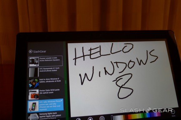
Aside from touchscreen and potential mice and physical keyboards, you can control the tablet using swipe motions, well integrated into the Metro UI. For example, a swipe to theright will pull out a bar of 5 charms: Search, Share, Start, Device and Settings. The multitasking system involves thumbnails like those in Windows Phone and shows apps running at the same time in a sidebar with the main app taking the most screen estate.
Keep in mind that you can also switch to the classic view like the one of Windows 7, but what’s the point since Win 8 is all about novelty? You’ll find more info in the hands on video below.
[youtube 97RtEABGt3M 660 520]
Post Footer automatically generated by Add Post Footer Plugin for wordpress.

