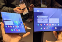
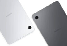
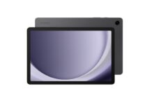
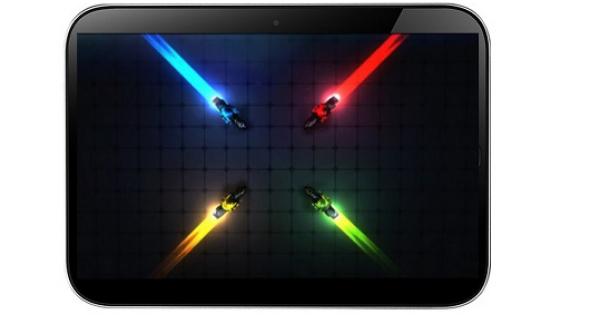
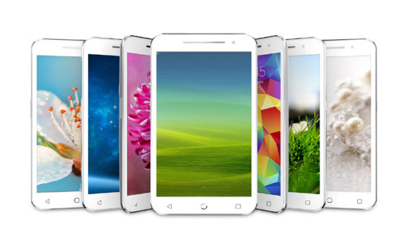
Samsung has reportedly sat down with Google at CES 2014, after the search engine giant’s officials were not happy at all with the tile-based UI of the Magazine UX shown on the latest Sammy tablets. This means we could get less of the TouchWiz customization in the future and more pure Android.
Samsung may be thinking of changing the Magazine UX, which is an Android skin that debuted on the Galaxy Note 3 and it involves a sort of combo between Flipboard and tiles. Samsung may also abandon some of its own homegrown apps (read bloatware), in order to clean up their devices. All I can say is good riddance, especially if more internal memory gets freed and the UI looks more minimalistic.
It’s interesting to see that the South Koreans have caved in fast to Google’s demands, instead of standing firm and threatening to leave Android altogether and go with Tizen. The reason behind this docility may be the fact that Samsung struck a deal with Google to work on the next Nexus phone, tablet, or phablet. What do you think of Samsung’s UX?
Post Footer automatically generated by Add Post Footer Plugin for wordpress.


