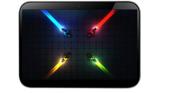
Remember Project Chameleon? We’ve written about it a bunch of times and now the startup project has reached a more evolved phase, getting the required funding on Kickstarter Project. This is an Android tablet UI that’s very original and has an interesting concept. It will be available as a beta version to the people who backed the project and it will come to the Google Play Store afterwards.
Below you can see a hands on demo of the UI on the Google Nexus 7 and it looks very nice. The project now has 6,420 backers and to me this interface looks like something between WeTab and MeeGo for tablets, which is a good thing. Chameleon replaces the classic Android Home screens and App Launcher with a beautiful UI, that involves multiple home screens, with your own layout of widgets and apps and all the relevant information you want, when you want it. This means that when you unlock the device, you’ll see the home screen that’s the most important to you.
Chameleon Home screens can be arranged depending on GPS locations, WiFi networks, time ranges and many more settings, so they’ll be relevant in a certain situation. You can setup a morning screen, a work screen, a Home and relaxation screen and many more. In Chameleon you’ll not only customize Home Screens, but also your own mini App Tray, showing you the apps you need, without all the clutter of a large grid.
[youtube p-pxG3BhlPc 660 520]
Post Footer automatically generated by Add Post Footer Plugin for wordpress.


