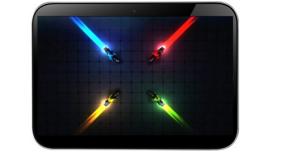
This week brought us Apple’s big launch event for the new iPhones and the long rumored iPad Pro. The 12.9 inch slate resembles the Surface Pro from Microsoft, but the fact that it runs iOS may cause some aesthetic concerns when it comes to homescreen organization mostly.
The iPad Pro is meant to be a device for professionals, for people who actually use the slate for profit and for work. It also has that special keyboard accessory to strengthen that approach, but there’s something off with the screen in this iteration. The Verge captured the picture above, showing a mountain of unused space on the screen, something you won’t see on Android or Windows 10 for example.
At 12 inches in diagonal, or better said almost 13 inches getting a maximum number of 25 icons per homescreen is ridiculous. If you think about it, Android has resizable widgets, showing info right there and right now, while the live tiles can also be resized and have numerous versions, that also show live info. Meanwhile, the iOS icons remain as cold and as “shortcut-ish” as ever, without any extra info offered.
Of course, some people may consider this a non problem and may prefer to have as few icons as possible on the homescreen, but the waste of space is still clear here. iOS 10 should be groundbreaking milestone, that probably changes everything… again, maybe even this layout.
Post Footer automatically generated by Add Post Footer Plugin for wordpress.


