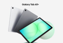
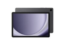
We’ve been hearing about Google’s dissatisfaction with the way that Samsung customized the interface of Android on its Pro tablets launched at CES. Google is now happy with the Magazine UX, but guess what… you can’t get rid of it…
The main reason why Google is upset is that the Magazine UX looks disturbingly much like the Metro UI. Samsung intends to forbid its customers to remove the Magazine UX, which is a core feature for the new gen of slates from Sammy. The South Koreans claim that this feature is built into the Pro series of slates.
The thing is that you can add or delete Magazine UX and standard Android screens as you which, but at least one Magazine UX screen must be preset at one time. From what we’ve heard Samsung intends to play nice and adopt milder customizations of Android in the future, so they don’t have a beef with Google.
Will this UI make it to 2015 for example?
Post Footer automatically generated by Add Post Footer Plugin for wordpress.


