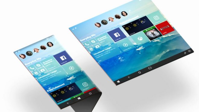
People are still dreaming of a better and brighter future for Windows 10, particularly its mobile version. We’re only left with concepts right now, such as the great one below, that seems more based on rows, rather than columns of icons and tiles.
German designer Nadir Aslam has envisioned this concept, which is an evolution from the standard Windows 10 experience to a fresh concept. The idea is to have an OS that functions across PC and mobile. The designs that Nadir has come up with are influenced by Microsoft’s Project NEON design elements, that have reached Windows 10 over the past years.
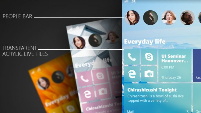
Extra transparency and functionality have been implemented here. Everything is better spaced, more aired out and simply fits in. We’ve got contacts on the taskbar, a row of favourite contacts at the top and a much more horizontal approach, compared to the vertical one from before. The Start menu is more compact, with some segments on the left side, feeling like bookmarks of sorts. The most important novelty here is that the mobile OS and desktop OS are now much more similar.
Post Footer automatically generated by Add Post Footer Plugin for wordpress.


