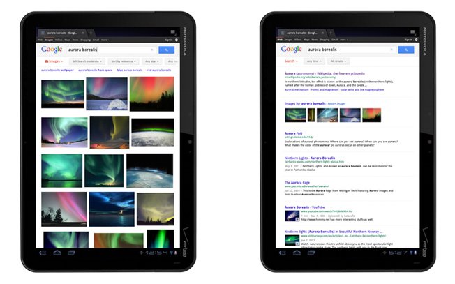
Google announced a couple of days ago a revamped search experience for its tablets, with the users accessing Google.com on slates only to find a change UI. Search results are now simplified, while the text, buttons and other feats are larger and easier to tap.
Also, Google created large image previews, thumbnails that load fast and a continuous scroll feature. The search page’s new version will rollout these days and can be seen on devices with Android 3.1 on board and on the iPad, in 36 languages. The search button is located below the search box and allows you to quickly access various types of results such as Images, Videos, Places and Shopping.
The viewing experience in the case of images has been improved, as has the loading time. Have you tried the new Google UI? How about a Chrome version for Honeycomb, guys?
Post Footer automatically generated by Add Post Footer Plugin for wordpress.


